- HostileCharts
- Posts
- It Changed Everything
It Changed Everything
I’ll admit something upfront.
When I first started studying technical analysis, a lot of it felt… mystical.
Lines on charts, patterns with funny names, people acting like they could predict the future off a triangle.
I wasn’t hostile towards it but I was a skeptic.
Coming from a CPA background and living inside financial statements, my brain is wired for structure, process, and evidence. I wanted to know:
Is there actually something robust under all this, or is it just drawing shapes and telling stories?
Breadth work was the first area that flipped the switch for me.
Looking under the hood of the market and seeing how many stocks are actually participating in a move made the whole game make sense. It turned “the market” from this vague scoreboard on TV into what it really is: a market of stocks — thousands of individual decisions aggregated into clean, testable signals.
It was the moment where I finally thought,
“Okay… this isn’t voodoo. This is data. This is behavior. This is participation.”
And I was hooked.
I dove into the literature, studied the legends, earned my CMT, and kept digging.
And that’s when Tim Hayes’ quote really started to hit home:
"Ultimately, when it comes to making money, a thorough knowledge of what the stock market is doing is more essential to investment success than understanding why the market is doing what it is doing."
Breadth lets you do exactly that.
It helps you understand what the market is doing without getting sucked into the endless narrative machine.
Once you internalize that, you stop trying to sound smart and start focusing on staying on the right side of the trend.
And honestly?
That shift alone has helped me ride this bull market far better than I ever would have without breadth work.
It’s what gave me the confidence to add when others were fearful, and to trust the market’s behavior rather than the headlines.
And after recording my weekly show yesterday breaking down my favorite breadth tools, how to align them with trend, and some of the tricks we have at our disposal today, I wanted to expand on it a bit more here.
Let’s get into it.
Classic Breadth Tools
When we talk about “breadth,” we’re really talking about participation.
Are a lot of stocks going up, or just a few mega caps dragging an index higher.
One of the cleanest, and most powerful tools for that is simply New Highs minus New Lows.
You can run this on the S&P 500, the NYSE, the Nasdaq 100, the Russell 2000 – whatever universe you care about.
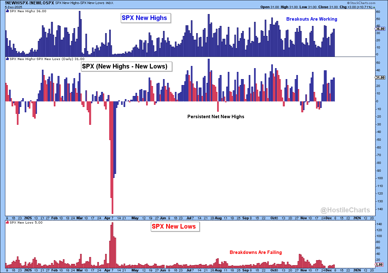
S&P 500: New Highs - New Lows
In a healthy bull market, you tend to see persistent net new highs.
On a chart, that looks like this: new highs in the top panel, new lows in the bottom panel, and the net line in the middle grinding above zero.
That’s the market telling you breakouts are working and breakdowns are failing. If you’re seeing five new lows and dozens of new highs in something like the S&P 500, that’s not bearish. That’s the hallmark of a bull market: breakouts resolving higher, breakdowns getting scooped back up.
Another one of my favorites is the percent of stocks above key moving averages.
Moving averages are just smoothed price data — simple tools to help us identify the trend based on the lookback period.

S&P 500 Trend Alignment with Moving Averages
I use this every single week in my Sunday Stalk List, and I add a twist: I break it down by sector to see where strength, weakness, and rotation are taking place.
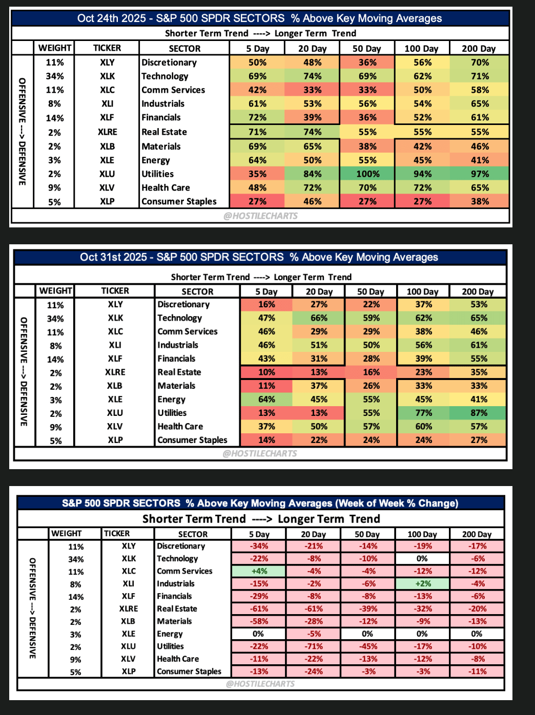
It quickly tells me if the participation inside each sector is bullish or bearish, and whether I should be leaning more offensive or defensive in my setups.
Now — one nuance I dig into in the video is what happens when price chops sideways. Moving averages can get noisy there.
That’s why there’s another tool I love that handles those environments really well: the Bullish Percent Index.
I gave it its own segment in the video because point-and-figure signals remove the time component and give an incredibly clean read on participation when moving averages start whipsawing.
If you haven’t used BPI before, go check out that part of the video — it’s worth adding to your toolkit.
Using Trend + Participation for Optimal Entries
Breadth becomes exponentially more powerful when you pair it with price and trend.
You guys have seen me use this breadth and trend model over and over again because it gives you clean, repeatable signals for buying opportunities within an underlying uptrend.
Breadth alignment with trend is one of the best tools we have for optimal entries.
Take the chart above as an example.
SPY is in a clear uptrend, riding a rising 50-day and 200-day moving average.
Underneath that, the lower panel shows the percent of S&P 500 members above their 20-day moving average.
Every time that reading washed out toward the lower bound (near ~20–30%) while the bigger trend was still up, those dips became powerful buy-the-dip zones. You can literally see these little breadth “scoops” align perfectly with price lows.
That’s the whole idea:
Weak short-term breadth is not bearish if the long-term trend is bullish. It’s fuel.
This is also what a breadth thrust is at its core, strong reversion from weak participation back to strong participation inside an ongoing uptrend.
Recently, we saw exactly that: percent above the 20-day went from ~30 to >70 in a matter of sessions.
That is classic thrust behavior, and it told you buyers were stepping in aggressively.
Modern Breadth Analysis with 21st Century ETFs
Now let’s fast-forward to the 21st century, where you don’t have to manually rip through thousands of charts every week to understand breadth.
We have a secret weapon: ETFs as breadth proxies.
In practice, that means using equal-weight and thematic ETFs as simple, visual ways to see participation.
Start with equal-weight indexes.
$EQAL ( ▼ 0.57% ) Russell 1000 equal-weight ETF gives every stock one vote. Same deal with an $RSP ( ▼ 0.79% ) S&P 500 equal-weight or $EQWL ( ▼ 0.98% ) S&P 100 equal-weight fund.
In the video, I highlighted the S&P 100 equal-weight base that looks ready to break out. That’s the largest and most important stocks in the world, all contributing on an equal basis. Hard to call that bearish.
Then drill down into equal-weight sector ETFs.
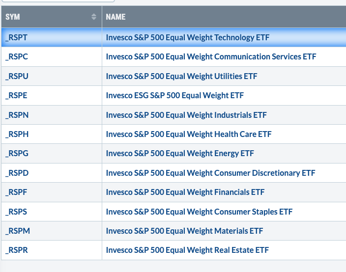
Equal Weight Sector ETFs
Track one-week, one-month, and one-year performance and sort that list.
If equal-weight Technology, Communication Services, Consumer Discretionary, Industrials, etc. are leading, that’s offensive breadth.
Finally, you’ve got “breadth ETFs” for risk-on themes – things like robotics, innovation, software, homebuilders, or whatever basket you care about.
In this weeks video, I talked about a trade in $ARKQ ( ▼ 1.69% ) .
It’s packed with offensive names across semis, autos, software, aerospace, and so on.
When my broader breadth work told me we were at a tradable low in a bull market, and I saw ARKQ retesting a clean support zone in an uptrend with RSI holding 50, that set up a simple risk/reward long.
That’s the process: use broad and sector-level breadth to define the environment, then use these modern ETFs to express risk-on or risk-off views without overcomplicating it.
The WHAT > The WHY
Breadth doesn’t have to be complicated.
Start with the classics, align them within the context of price, and revisit them consistently.
Do that and you’ll stop projecting your opinions onto the market and start reading what’s actually happening underneath the surface.
And nailing the what will make you more money than pinpointing the why
Anyway, that’s my two cents.
My Weekly Show - Thompson’s Two Cents
🚀 Throw it on 1.5x speed and let it rip.
👍 Give it a like. It’s the easiest way to show me some love.
The Sunday Stalk List | Ep. 25
If you want clean charts, clear setups, and tactical insights — this one’s for you.
It hits inboxes every Sunday so you know exactly what to keep an eye on for the week ahead.
Cheers,
Larry Thompson, CMT CPA